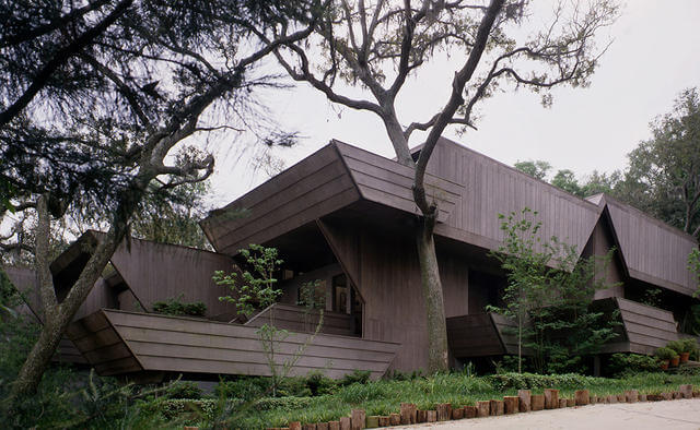
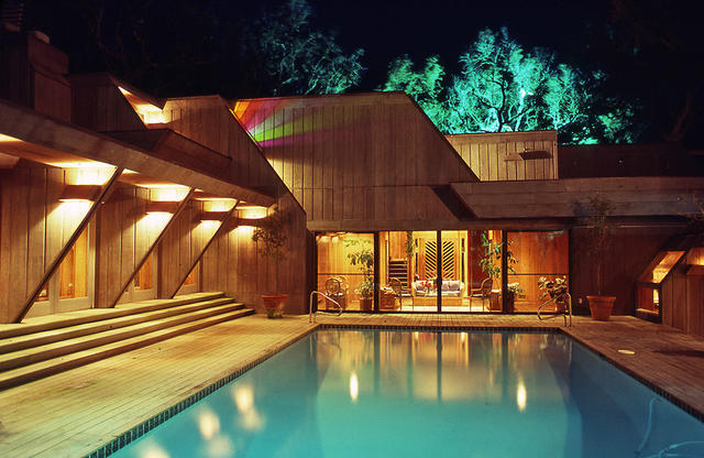
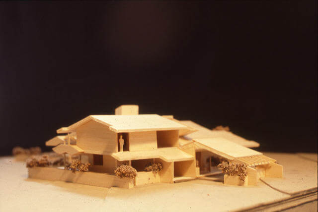
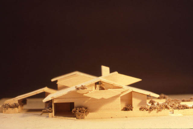
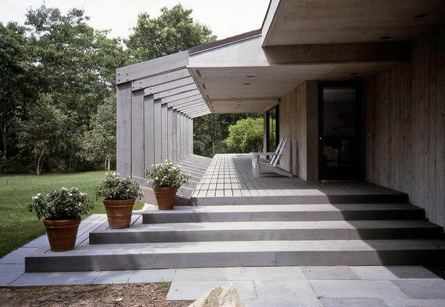
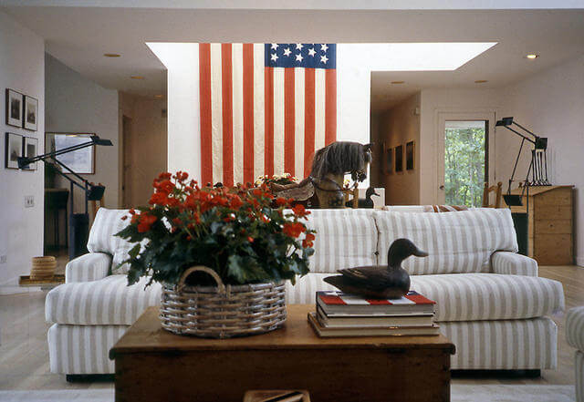
My first commission in Pensacola, Florida, from 1977 and published in Southern Accents, for Ted and Natalie Ciano who entrusted a newly licensed 27 year old Architect with no built work to design a 5000 square foot house based solely on my showing them photographs of Fallingwater, and telling them their house did not have to look like all the others in their neighborhood.
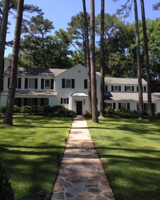
My second commission from 1977, a renovation and addition to a residence in my hometown of Gadsden, Alabama for Mary Goss Hardin and her daughters Mary Lee and Elisabeth with whom I grew up.
The original white brick and green shuttered home was a modest 1600 square feet, and I wrapped around it a 4000 square foot addition with every detail in keeping with the original home.
I always refer to it as my “Senator’s Home” as it remains among the most stately and timeless of my career.
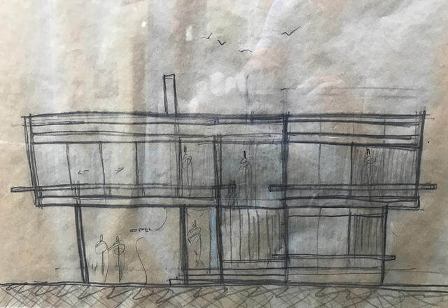
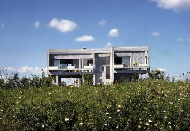
This is my original concept sketch (replete with seagulls I might add) of my first Hamptons' project on Sandpiper Lane in Bridgehampton, and an archival photo of the finished home sitting in the splendid isolation of Bridgehampton fields in 1978.
The upside down residence was a modest 1800 square feet, and included 4 bedrooms and 2 baths. The home was not air conditioned but featured balconies off every room to capture the nearby ocean breezes.
The New York Times used an almost identical photograph of the project as an example of the "Gwathmey" style homes being built in a wave of new construction in The Hamptons.
The original owners still live in the house and commissioned an extensive renovation and addition in 2014. (See Chapter 4)
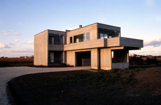
Building on the success of my project on Sandpiper Lane in Bridgehampton, here, my second Hamptons' house, another 1800 square foot upside down home in Sagaponack, NY.
Sited at the edge of a vast potato field with sweeping views of The Atlantic, the primary living spaces and master bedroom were located on the second floor. Like on Sandpiper Lane, all 4 bedrooms had balconies to catch the nearby ocean breezes.
The Living room has glass on three sides and was thrust into the landscape above a covered entry/carport and opens onto a cantilevered deck. The entire space felt as if one was standing on the bridge of a ship.
This was the second of seven similar homes I designed in The Hamptons between 1977 - 1984, and I have often referred to them as my "finger exercises", as I tried out many design concepts and material experimentations which reoccurred in much larger projects later in my work.
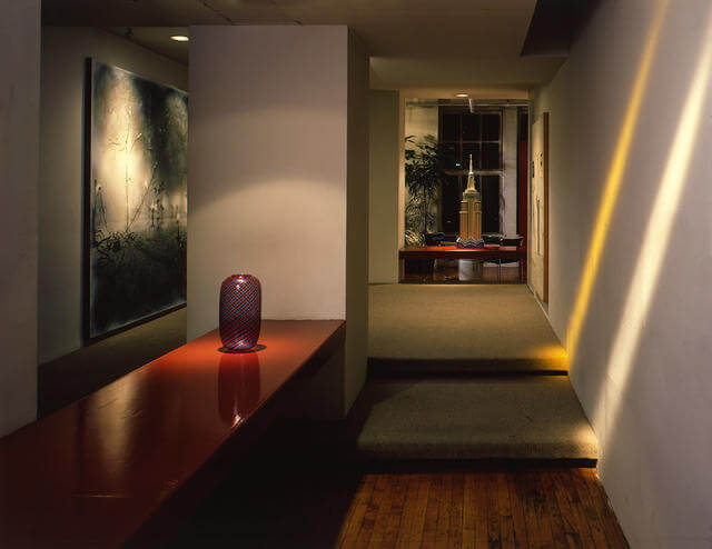
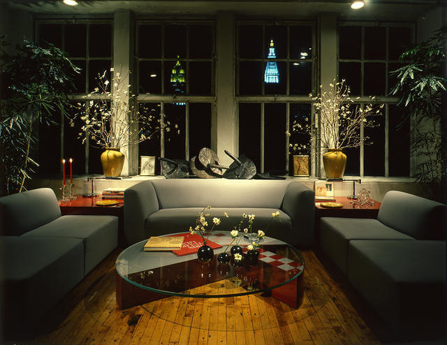
Having worked out of a spare room at my apartment in The Osborne for 2 years, in 1978 I took the plunge and purchased a 5000 square foot loft on East 16th Street and Union Square. The floor through raw space with 28 windows was the perfect envelope in which to create an apartment and office.
Here, the apartment published in Connoisseur, featured a dramatic Entrance Gallery to showcase my evolving art collection, and the money shot of the Living Room with The Empire State and Met Life Buildings as the focal points through the window wall.
The design featured light coves tucked into the edges of both walls and ceilings to wash adjacent wall planes with high intensity theatrical spots outfitted with colored gels to echo the lighting of the Empire State Building. Just one of the many lighting techniques I learned from the legendary windows at Henri Bendel in the mid-1970s.
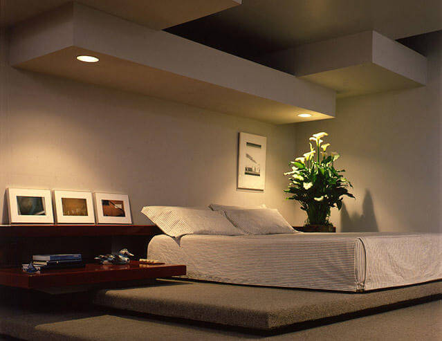
The third shot is of the Master Bedroom which overlooked the Living Room and subsequent view from its own Dias. This was to be my home until moving to Bridgehampton in 1984, and saw quite a history of New York pass through its portals.
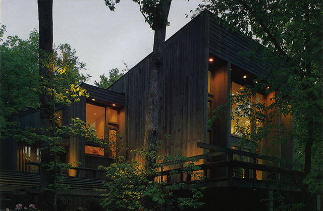
In 1979 I completed the second large scale home in my hometown of Gadsden, Alabama. Webb and Linda Sledge, asked me to create a modern residence that would blend into its deep woodland 5 acre setting.
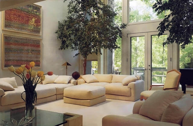
The resulting composition of towering vertical wall planes sheathed in wood separated by glass end conditions encompassed 5000 square feet of open, flowing and interconnected interior space. Only ten doors were used in the entire residence.
The resulting interior volume allowed for second floor balconies overlooking the first floor as well as outwards through the tall glass window walls. Ribbons of skylights separating the roof from the exterior walls further articulating the architectural elements of vertical and horizontal planes.
This project was the first where I became actively engaged with the selection of furnishings, textiles, carpeting, art and accessories with the clients visiting me in New York on numerous shopping excursions, gallery and artist studio visits. This enabled a cohesive and consistent interiors scheme in scale with the residence and set the tone for my future forays into Interior Design.
Included here, images from The Southern Accents article entitled "Expansive Spaces, An Airy Residence in the Alabama Woods" from (October 1987).
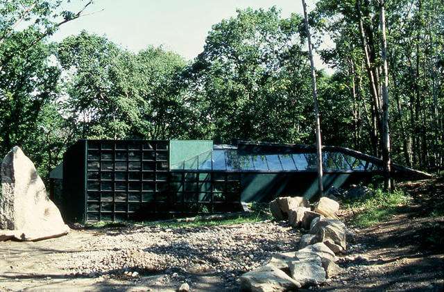
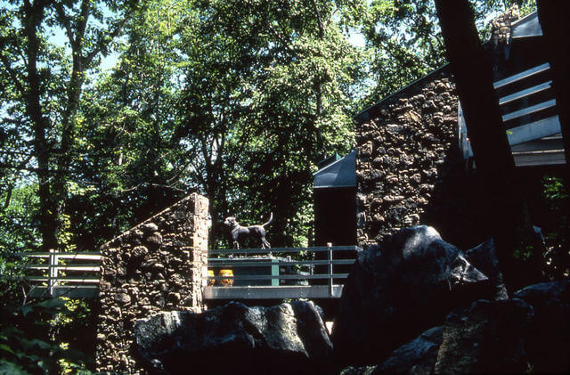
In 1980 I was one of a handful of young Architects interviewed by the realist painter Lowell Nesbitt to design a new compound of buildings on 16 acres of mountainside overlooking a New York City Reservoir in Carmel, NY. The compound was to be named "Stoneleigh" for his beloved mastiff.
Lowell was interested in building a "Solar Home" incorporating the most tried and true methods of Passive Solar Design available at the time. At one of my many interviews, (one of which included an onsite picnic on a rock outcropping catered by The Box Tree), I noticed a rough draft of a painting on his studio easel of a favorite Iris of mine from my Grandparents farm in Alabama.
I told him that if I was selected as his Architect in lieu of a retainer fee I would take the finished painting. Needless to say a relationship was forged that would not only result in a revolutionary design for the 2000 square foot main house (built over the site of that picnic), but also a walled "Echo Garden" as well as a Pyramidal Studio, replete with an interior lap pool.
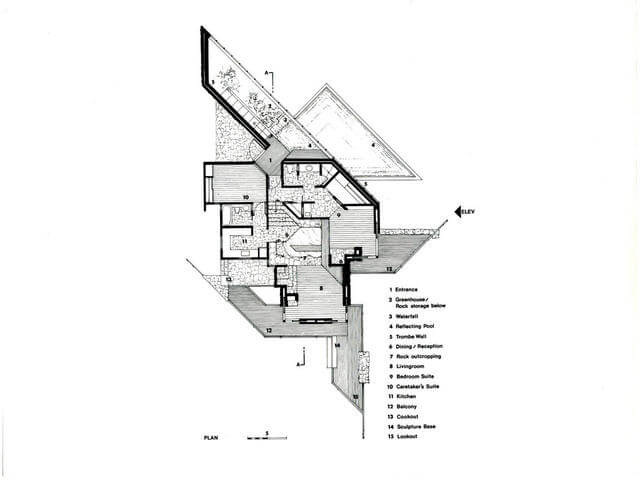
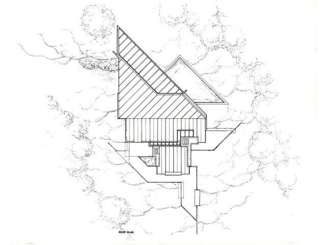
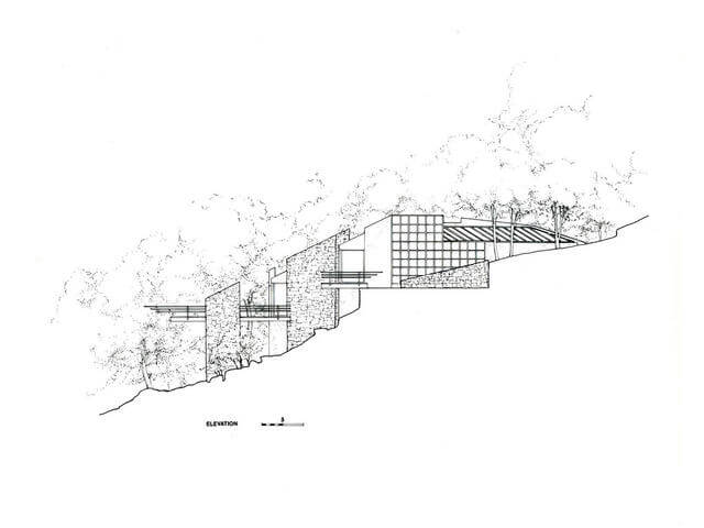
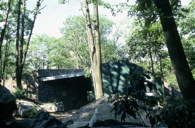
Here, the primary floor plan detailing the three levels of the Main House as it enveloped the rock outcropping and cascaded down the mountainside, the roof plan, and elevation drawing all of which appeared in The New York Times, as well as photographs of the finished residence incised into the steep mountainside. The building’s roof literally touches the ground at one point, while on the other side exterior balconies float some 40 feet above the rugged cascade of boulders below.
The house was composed of concrete walls stuccoed dark green and stone quarried from the site. Aluminum was used for the roof, railings, and subway grating which formed the numerous cantilevered exterior balconies. All materials were used both inside and outside the residence for a unified composition of architectural elements.
A south facing trombe wall of glazing, and adjacent greenhouse were employed to collect and store heat and transmit warm air throughout the residence to satisfy the passive solar requirements of the home.
Culling through the hundreds of slides of the project I thought these shots best showcased the solar components and the buildings unique relationship to the site.
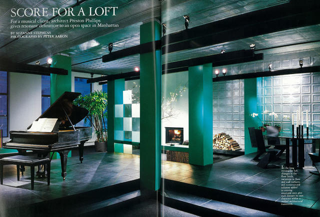
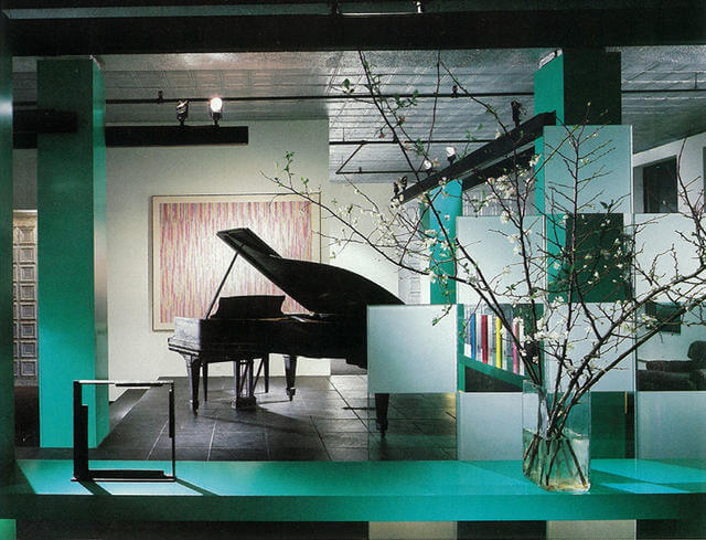
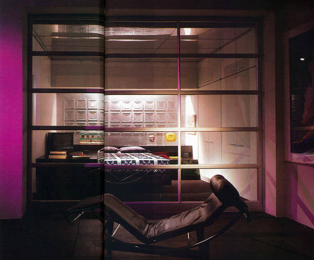
With the success and exposure of my own 16th Street Loft, I received a number of Loft commissions between 1980-84. This is one of the best known on 23rd Street for my good friend Chris Babcock, and published in House and Garden in 1985.
The 3800 square feet of raw space, with high ceilings of pressed tin, was the perfect backdrop for my concept of a vast space divided by raised platforms of black slate and screens of sandblasted glass panels. Finding an exact match of the original pressed tin material allowed its use on wall planes to further define spaces within the open plan.
Augmented by the owner's decision to use an ultramarine lacquer on the column covers and low horizontal elements, and the use of "light beams" cantilevered from these columns, the space took on a personality, particularly at night, that melded with the downtown club scene, resulting in Le Tout Gay New York passing through its portals.
The tour de force however, was the use of an overhead glass door sourced from a catalog for Fire Station Doors, with mirror glass panels dividing the master bedroom from the rest of the apartment.
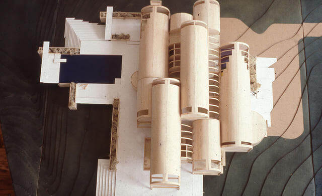
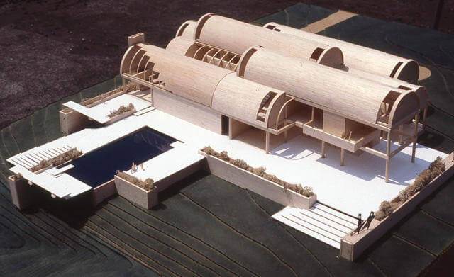
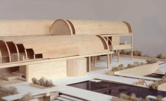
My first clients in Pensacola, Florida invited good friends from Houston, Texas to see their new home. After spending a weekend in the just completed residence I was called to come to Houston to see property they owned in River Oaks.
They wanted a French Chateau style residence but after looking deeper I suggested that they visit the decade old Kimbell Art Museum in Fort Worth by Louis Kahn.
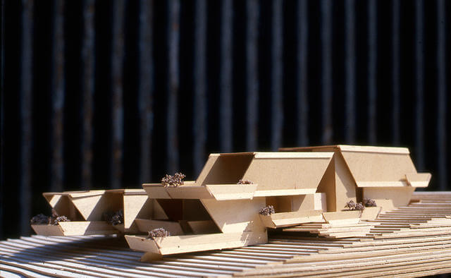
Here, my Design Development model of the 8000 square foot residence of poured concrete walls and roof vaults, many with telescoping skylights.
I recall vividly, lo these many decades since, sitting at a dinner party in The Pines when the concept came to me. I excused myself, decamped to a nearby desk, and sketched the entire house in less than a half hour. I rejoined the dinner party (it was the 80s after all) and went on with my weekend.
Although never realized as a built project, it remains among my favorite design concepts and has played an important role in my later work.
For my last residential commission prior to moving my office to Bridgehampton, in 1983 Gordon and Jennifer Cooke retained me to design a weekend residence in Sagaponack for their young family. Gordon was Director of Special Events for Bloomingdales, and as such oversaw a wide range of creative activities including annual trips to far flung world capitals, resulting in a warehouse full of furnishings, textiles, art objects, and accessories to select from for the new home.
The 3800 square foot residence featured a central Great Room anchored on one end by a fireplace and on the other by a skylit stairwell to the children's playroom downstairs. Long walls of glass with clerestory windows formed both sides of the space opening the home to the great outdoors, one of which showcased a long entrance porch with an out-rigging of beams to both support and envelope the porch as an extension of the interior.
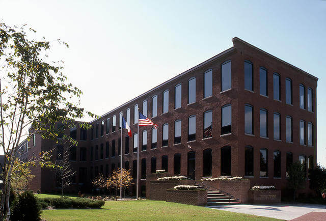
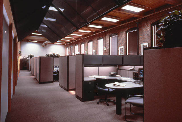
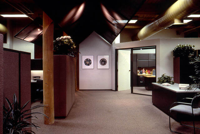
I moved my office to Bridgehampton in 1984 and my first commission was from Bill Jorgensen, an old friend who had just taken the helm of Fanny Farmer Candies in Boston. Bill was familiar with a number of my loft designs in New York, and thought my talents ideal for an 80,000 square foot factory building he had secured for the company's new headquarters.
The building's four floors of raw space, with towering windows, brick walls, wood columns, floors, and ceilings was the ideal envelope to establish a modern, open interior plan, and take my many years of loft experience to the next level.
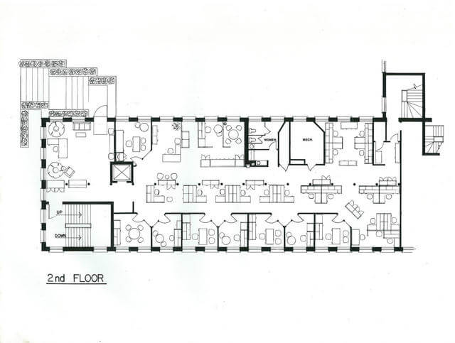
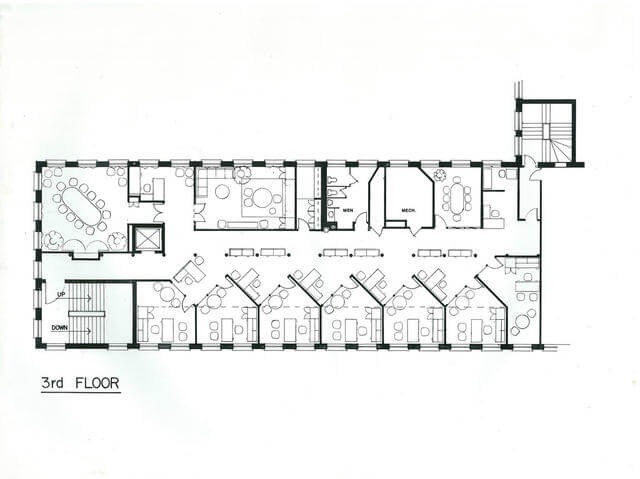
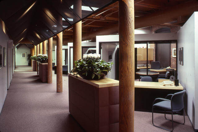
Included here a photograph of the renovated building’s exterior, and two floor plans showcasing the interior layout of offices, work stations and circulation, as well as interior photography of the finished Headquarters.
Circulation through each of the four floors was defined by hanging "tents" of fiberglass scrim with high intensity track lighting above, a technique I learned in 1981 from the late Architect Frank Israel's minimalist set design for the Philip Glass opera "Satyagraha".
Vintage black and white artwork and advertising going back decades were re-shot and hand tinted in pastel colors by James B. Bissel to provide a continuity with the company's past.
The project was published in Interior Design Magazine in 1987 and was my first foray into corporate design. It provided a basis for future corporate commissions.